
Plotting and displaying data
Summarising and Grouping Data
A large
set of statistical data conveys very little information as it stands and it is
usually helpful to summarise it in a more concise form before attempting to draw
any conclusions. Observed data can be divided into classes by grouping
together those observations having a particular characteristic in common.
The number of observations falling into a particular class, or cell, is called the FREQUENCY, f, corresponding to that class. The complete set of observations can be summarised by the frequencies corresponding to each class. This is termed a FREQUENCY DISTRIBUTION.
Notation
The variable observed is denoted by a
capital letter, eg X, and the values that X can have are denoted
by the corresponding small letter ![]() .
.
(a) Discrete Variables
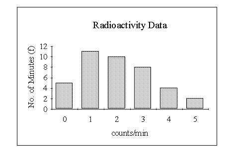
Consider the
data on the number of particles emitted by a radio-active source. Here
X is the number of particles emitted and ![]() etc represent the observed values.
etc represent the observed values.
We can construct the frequency table as follows:
The above method of forming a frequency distribution is somewhat antiquated. The procedure is much more efficient if you use a spreadsheet program like Excel.
A frequency distribution for a discrete variable can be presented graphically by means of a bar chart This consists of a set of rectangles, the heights of which represent the frequencies. However, in most practical examples the width of each rectangle is made the same so that the area is also proportional to the frequency. We shall see that in certain circumstances it is more convenient to represent frequencies as areas.
Consider the frequency distribution on the number of particles emitted by a radio-active source.
Grouping of data
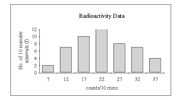
Consider now the data
showing the number of radio-active particles emitted in 10 minute periods. With
such a wide range of possible numbers of particles (the smallest number is 5 and
the largest 39) it is obvious that, with the limited amount of data available,
simply finding the frequencies corresponding to each value of X would
result in many zero scores. In order to obtain some idea of the distribution it
will be necessary to group the data by finding the frequencies corresponding to
classes of values of ![]() . For example
. For example
Note that each class is denoted by two values. These are termed the lower and upper class end marks. We may define a class midpoint for each class as the mean of respective class end marks. In the above example the class midpoints are 7, 12, 17, 22, 27, 32, 37. Class midpoints are useful reference points when drawing bar charts.
We define the class interval, c, as the difference between one class midpoint and the next higher one. In the above example the class interval is 5. Finally, for each class we define a lower and upper class boundary as follows:
lower class boundary = class midpoint ![]()
upper class boundary = class midpoint ![]()
For the above example the classes may be described by means of the class
boundaries:
| class |
| 4.5 - 9.5 |
| 9.5 - 14.5 |
| 14.5 - 19.5 |
| 19.5 - 24.5 |
| 24.5 - 29.5 |
| 29.5 - 34.5 |
| 34.5 - 39.5 |
The bar chart for the data uses the class end marks to identify each class, as shown below.
(b) Continuous Variables
If
measurements are quoted with a given specified accuracy the exact class
boundaries can be determined. For example a table showing the distribution
of plant heights might be
height (to nearest cm) 60 - 62 63 - 65 66 - 68 etc
frequency 6 18 14
In this case the classes are really, 59.5 to 62.5, 62.5 to 65.5, 65.5 to 68.5, etc.
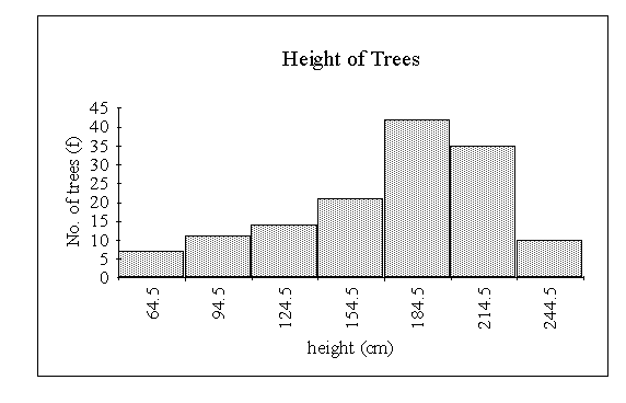
A frequency distribution for a continuous variable is presented graphically by means of a HISTOGRAM (this is the name given to a bar chart based on continuous data). Note that adjacent bars in a histogram are drawn touching each other, whereas in the other bar charts discussed they generally are not. Consider the following example:
The heights (in cm) of 140 nine year old trees of a certain type were
measured. The following table shows the data grouped into classes:
|
|
|
|
|
|
|
|
|
|
|
|
|
|
|
|
|
|
|
|
|
|
|
|
In this case the classes are really 49.5 - 79.5, 79.5 - 109.5, etc.
Frequency Polygon
Often a FREQUENCY
POLYGON is drawn rather than a histogram. This is done by plotting the
frequency of each class as a dot at the class midpoint and then connecting each
adjacent pair of dots by a straight line. This is, of course, the same as if the
midpoints of the tops of the rectangles of the histogram are joined by straight
lines. Frequency polygons are also commonly used for discrete distributions. The
frequency polygon for the distribution of tree heights is:
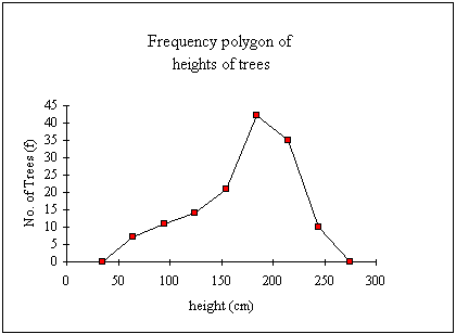
Notice that the polygon is extended down to the horizontal axis to the mid-points of the classes that could be added at either end of the distribution, ie 34.5 and 274.5.
Frequency polygons are arguably more useful in the visual comparison of two or more frequency distributions than histograms.